Drakes AW21 'Perennial' Campaign Shoot


Once again, we worked with our friends at Drakes Menswear of Savile Row. The campaign was shot by renowned Photographer John Spinks on location in Suffolk with actor and friend of the Brand - Tobias Menzies.

We styled the Collection for the Editorial launch of their AW21 ‘Perennial’ Campaign, which is a celebration of the staple elements that are essential in any wardrobe.

These garments provide the mainstay of the Drakes Product offer, such as Footwear, Knitwear, Shirting and of course Tailoring.

Functional, pragmatic styling - Here today, Here Tomorrow…

Credits:

Photography - @John_spinks

Styling - Nathan Hicks (The Invisible Man)

 
Screenshot 2021-07-27 at 13.12.22.png
 
Screenshot 2021-07-27 at 13.11.46.png
 
Screenshot 2021-07-27 at 13.05.06.png
 
Screenshot 2021-07-27 at 13.09.21.png
 
Screenshot 2021-07-27 at 13.07.59.png
 
Screenshot 2021-07-27 at 13.03.14.png
 
Screenshot 2021-07-27 at 13.09.06.png


Marc Jacobs is 'Back with a Bang!'


Marc Jacobs Fall/Winter 21 show was a comeback of multiple kinds. Jacobs hasn’t shown a collection since his spellbinding fall 2020 presentation circa February of last year,


Stepping inside Jacobs’s New York Public Library venue, the collective sense of joy was apparent. Smiles and hugs and even kisses were exchanged.


The press notes opened with a single word: ‘Happiness’. “On the journey back to doing what we love most, in the wake of immeasurable loss, loneliness, fear, anxiety and uncertainty, I am reminded of why creativity is so vital to our existence,” Jacobs said. “To life.” Having swerved the digital presentations adopted by many of his peers over the past 18 months, the designer staged his first Covid-era showcase on a real runway, with a real – albeit small – audience (all guests had presented proof of vaccination).

The show was also beamed onto the facade of Bergdorf Goodman for all of Manhattan to see, part of Jacobs’s efforts to create a “shared experience”, and offer a much-needed “moment of inspiration, curiosity, wonder and possibility”. Mission accomplished!


What we got was Marc Jacobs couture, a bold statement about the dynamism and allure of dramatic mid-century and, yes, Space Age-y proportions, filtered through an American sportswear vernacular and put together with an eye to the assemblage style and rule-breaking of Gen Z.

Beneath the snug beanies, inflated hoods and voluminous snoods, onlookers could discern the unmistakable features of the new-gen supers. Imaan Hammam’s camel skirt and chunky red roll neck with gently elongated sleeves was styled with prim ankle socks and platform Mary-Janes, while Gigi Hadid sported the shimmering paillettes that were a recurring theme of the collection that fused Jacobs’ punky Americana with the campy, retro-futuristic aesthetics of the Space Age.

The injection of shimmer, and a selection of flesh-baring cut-out bodysuits, nodded to our re-emergence wardrobes, but the collection also reflected fashion’s recent obsession with all things functional. Duvet coats were ramped up with bold prints and ample hoods perfect for anyone harbouring a secret desire to keep social distancing forever.


Elsewhere. XXL jackets were blown up to @itsmaysmemes proportions were worn with sequin disc studded sheaths and skirts, as well as ski-pants, with many looks finished with chunky woollen snoods, puffed-up shawls, headscarves and baseball caps. Jacobs’s celebration of joy and creativity manifested in graphic logos, geometric prints & a rainbow of colour and wearing this cocooning, exuberant collection, it’s hard to imagine you could be anything but Happy…

 
IMG_1062.jpg


The Quiet Radical / Bottega Veneta – Signs Off from Social Media

 
Bottega Veneta deleted.jpg
 

‘Break the Internet’ Bottega went one further and Deleted it… And it’s not just Instagram who has gotten the cold shoulder: the brand has also removed itself from Twitter and Facebook. The move means Bottega Veneta, is the first fashion brand to scrub its social media presence.


But to me this isn’t the real story, it feels quite simply like just another master stroke by a Brand which is on a Meteoric rise and led by the young visionary Creative Director - Daniel Lee. 

 
BV-Creative-Director-Daniel-Lee-portrait.jpeg
 

Very little was known about Daniel Lee and when Kering announced that the 32-year-old Brit was taking over as creative director at Bottega Veneta. Beyond Lee’s age and a handsome photo of him in a white T-shirt and jeans, the Kering press release stated his most recent position as director of ready-to-wear design at Celine and a string of posts at Maison Margiela, Balenciaga, and Donna Karan.


Two years later, the industry knows little more about him. Anomalously for a millennial, Lee doesn’t have an Instagram account and hasn’t been making the social rounds in Milan. By his own account, his closest friends aren’t in fashion. He’s focused on the work.

 
maxresdefault.jpg
 

Perhaps this sense of practicality can be attributed to his upbringing. Raised in Bradford, where his father worked as a mechanic and his mother was a stay-at-home mum (he is the eldest of three – his brother is a plumber and his sister is an A&E nurse: “They do really different, useful things,” he acknowledges), Lee was an academic child. “I was a geek. Still am,” he says, smiling.

He was good at languages and considered a profession in the law, but what he loved most, he recalls, was “making things”. His creativity resulted in a place at Central saint Martins then internships with Martin Margiela and at Balenciaga under the direction of Nicolas Ghesquiere. His graduate collection earned him a job with Donna Karan in New York, where he stayed for two years, before being plucked by Celine, eventually working his way up to Phoebe Philo’s ready-to-wear design director.

 
00002-BOTTEGA-VENETA-DETAILS-SS21-RTW.jpg
 

In a 2018 interview with Vogue,Lee talked about his task of keeping Bottega Veneta relevant among a younger audience, his ambivalence towards social media was hard to miss. “I just think the world changes very fast,” he said. “Obviously I’m from a very different generation. I am a millennial. To me it’s not a foreign territory. I grew up with the Internet. I’m aware of social media; I like it in some respects, I don’t in others. It’s part of modern-day culture. Obviously, fashion is about change; it’s a kind of conversation about the world. Yeah, we have to keep up, for sure.”


The longer you think about it, the more the strategy makes sense for Bottega Veneta. Last month, he opted for a salon performance with a two-month image embargo instead. And of course, he worked under the famously offline Phoebe Philo during her tenure at Celine. Back then, Celine barely had a website and did not offer e-commerce, a decision that turned its stores into sacred spaces.


RND05203 copy.jpg
 
BV2.jpg
 
RND05189 copy.jpg
 
RND05344.jpg
 

Seeing as Lee has made a point of going against the grain thus far—just when we think we know what to expect from his Bottega—his pivot away from social media (particularly when brands are increasingly reliant on it) makes a noticeable statement.

 
Screen Shot 2021-01-08 at 16.16.04.png
 

Rules are rules, but 33-year-old Lee is intent on rewriting them. Take one of Bottega Veneta’s famed intrecciato woven handbags, for example, a staple of the brand since it was founded in 1966. His first move on taking over from Tomas Maier, who had helmed the house for 17 years, was to blow it up, supersizing the technique to dramatic new proportions. That single design spoke volumes about his Bottega Veneta: Lee respects its heritage but has the guts to do things his way. “With a little bit of thinking you can do so much with the weave,” he says. “I liked the idea of enlarging it because I like things that are bold and quite direct. I like things that are straightforward.”

 
00061-BOTTEGA-VENETA-RESORT-21.jpg
 

The brand have taken the ‘Chain’ to the streets of Sydney as part of its new installation The Gold Chain in Campbell’s Cove. It’s here the freshly-minted BV symbol sits alongside another icon, the Sydney Harbour – flanked by infamous Australian landmarks, the Sydney Opera House and the Sydney Harbour Bridge.

As you can see in the image below, The Gold Chain is pretty much as described – a gigantic gourmette chain, draped and coiled over a matching gilded platform. According to the designer, the installation was created to bring the chain beyond the product to signify Bottega Veneta’s brand philosophy.

“An iconic emblem of the brand, the Bottega Veneta chain imbues strength, self-confidence and individuality,” the Italian house said in a statement. The Gold Chain’s impressive settings continue across the globe, with the house linking up with other international cities for the installation, including Tokyo and Shanghai.

 
Bottega-V-Syd-Install-Day-012_retouched.jpg
 

As the designer label du jour right now, Bottega Veneta can be counted on to turn even the most unimaginative items into sartorial gold – case in point, the house’s now-iconic chunky chain, which decorates a number of Bottega Veneta’s ever popular apparel and accessories, including the Chain Pouch and chain-embellished mesh pumps.

 
Bottega_Veneta_Pouch_Chain_Green.jpg
 
00017-bottega-veneta-milan-pre-fall-19-credit-bottega-veneta.jpg
 

When the news was announced that Lee would replace Maier, he may have been an unknown, but his Céline backstory spread like wildfire among fashion editors, buyers and customers left bereft by Philo’s departure. In turn, his debut for the autumn pre-collection was the most eagerly awaited of recent seasons.


He was quoted saying “My job is to really make Bottega Veneta part of the fashion conversation, but this is a true heritage house, and that is something that moves a lot slower and in a very different way to something that’s ‘fashion’,” he explains. “Trying to change this house into a fashion brand is a huge task.” Judging by his few collections, he has made it look relatively easy.


Is going off the radar the new luxury?

 
00009-BOTTEGA-VENETA-RESORT-21.jpg
Source: The Quiet Radical

The Greater the Storm the Brighter the Rainbow !

a56cb7cb0954092c20f6d75c8b561e64.jpg
 

Coronavirus has dominated headlines across the world for months now, and the impact it has had on businesses in a variety of sectors has been devastating. There is no denying we are in one of the biggest economic storms of our lifetime and past generations.

What we need now is ‘Hope’ and this can come in many forms, but for me the greatest weapon is ‘Positivity’.  I suggest we forget about what is broken, and focus on the things that do work. Let's do more of those. As always, in such situations, we have two broad options: fight or flight. There will be those who run and hide and wait for this lousy cloud to pass. But there will also be those who choose to innovate, Create and identify new opportunities, to define new ways of working. There will be those who want to fight.

Which one are you?

 
7838d7e11242d038e3b36c9a01b8349f.jpg
 

“The Future is Bright”

As the lockdown is eased, the economy should start to bounce back. Factories can fire up production and building sites get back to work and now that the stores are finally set to re-open across the country next week,  families can begin to do more shopping…

“Brands have to look at how to re-engage with the customer during the 'New Normal’ and with social distancing rules set to stay in play for some time or for the foreseeable future.

“Good businesses were good before the crisis and they will be good after it.”

fc734678a98ac7258670ca0d665b889d.jpg
 

Colour plays a vitally important role in the world in which we live. Colour can sway thinking, change actions, and cause reactions. It can irritate or soothe your eyes, raise your blood pressure or suppress your appetite. ... As a powerful form of communication, colour is irreplaceable ! 

 
8b80697acb64fcc5e7e1940ac1f2de88.jpg
 
3de135ec914738fbb6e78eb9cf04ff50.jpg
 
Screen Shot 2020-06-09 at 17.02.58.png
 
b84c13ffdd621f5185c0093992c74d73.jpg
 
96d33f341d36ba2c7f46f357eedd34cb.jpg
 
bd89d723c2bfb3836b8d868fa9e31360.jpg
 
bfda4b6edc49c54ebac92db3852edcd6-1.jpg
 

“Colour gives us inspiration”

I believe we will need this positive element more than ever over the coming months and in the Fashion seasons of 2020 and what’s left of the 'High Summer' period and the arrival of the Fall Collections. I have already witnessed how Brands have consciously embraced a rich and vivid palette of colour and feel there is a real opportunity to embrace and infuse this into our retail environments and communication platforms and therefore think outside the box and look at creative opportunities maybe not considered before such as queues outside stores, captive audiences, escalators, airport terminals, public spaces and our sometimes mundane architectural landscape.

We must resist the easy option of generic / bland solutions and focus on ways of lifting the spirits of the brave consumers helping to get our economy off it’s knees.

 
80a9d6e15f4dfecc5eacb50c879849c1.jpg
 
7be76d99d73f325f99d0a83c48490934.jpg
 
1a3befeb4fb0a31dd42ddbb12bcc4922.jpg
 
0d4b54743f9707931d4fa96f6bfe33ce.jpg
 
ee85c5025a1da3e9f64118803646c4a8.jpg
 
ffc0d5c813f26328c0f3dfbd0a8a1b8b.jpg
 
1328f7c1d44b0dfba69c24aac0f0ded4.jpg
 
c656584e1648ad97996c3eb30d382a69.jpg
 
fa2fbca8bd2e32590a900b327cbec2ed.jpg
 
99edb319391d75bc0bbe61d67f0efcac.jpg
 
8110800ba27ac0ca697c44e6d3445431.jpg
 

“We are not in Kansas anymore…”


Rainbows are used as a symbol of ‘Peace and Hope' as they often appear when the sun follows a heavy rainfall. They serve to remind us that there is hope and light to follow even after dark times.

Screen Shot 2020-06-09 at 17.15.12.png

Each of the original eight colours represented an idea: pink for sexuality, red for life, orange for healing, yellow for sun, green for nature, blue for art, indigo for harmony, and violet for spirit. Before becoming synonymous with fabulous pride movements, the rainbow flag has stood for many social movements. The colours reflect the diversity of the LGBTQ community, as the flag is often used as a symbol of gay pride during LGBTQ rights marches. ... The rainbow flag is also commonly used as a general symbol of social equality and individuality.

 
Screen Shot 2020-06-09 at 17.06.43.png
 
17dd0390dfc76e70635b91ba8ad96dd9.jpg
 
ef5a943f00dd8c465ed0eab0abd63ef9.jpg
 
93226fd8f3a80d37549f343eb881048c.jpg
 
d2a2bb14a2d801656c186f8894e45072.jpg
 

The rainbow meaning also teaches us to embrace our own differences and the differences of those around us. Like the rainbow, these things can seem far away and out of our reach.

The important thing, though, is that we keep striving for them. The rainbow symbolism is powerful, it reminds us of the endless possibilities, it shows us how vast and magical our world is.

“Rainbows challenge us to confront and embrace our own potential.”


“Storms don’t last forever…”

3cb5bb0b65c3d6ad1016c4d7628b46da.jpg
 
4778d850dfe2d6c3a0e524c7def8153e.jpg
 
a13171ae852f6ebdf41f74c9c4fce28b.jpg
 
0aa4795e83a0a310d48be87441df43a8.jpg
 
Screen Shot 2020-06-09 at 17.06.15.png
 

Remember Storms don’t last forever, rainbows are often seen after a rainstorm when the sun breaks through the clouds. This provides us with a very powerful and important message:

Good and Beautiful things often follow the darkest storms...

Screen Shot 2020-06-10 at 15.40.26.png

SOVIET BUS STOPS


From Brutalism to sheer whimsy, these images are just a small edit of images from a beautiful book by Canadian Photographer ‘Chris Herwig’ which surveys hundreds of unique public structures raised beyond the Iron Curtain.

1*0P1FCD6rCsdEWnKPPuVFTQ.jpeg
 

The Soviet Union is a time and a place commonly misinterpreted as one of conformity and of restrictions on creative freedom. To the contrary, functionaries of the state, albeit sometimes anonymously, were experimenting in design and planning departments across the entire territory.

Comprised of photographs from Kazakhstan, Turkmenistan, Uzbekistan, Kyrgyzstan, Tajikistan, Ukraine, Moldova, Armenia, Georgia, Lithuania, Latvia, Belarus, Estonia and the disputed region of Abkhazia, Herwig’s recent book Soviet Bus Stops is the most comprehensive survey of Soviet bus stop design in print. The designs he reveals are as daring as they are unexpected.

23.jpg
 
22.jpg
 

On a long-distance bicycle trip from London to St. Petersburg in 2002, photographer Chris Herwig encountered something unexpected in the barren post-Soviet landscapes—artsy, unusual, and almost spaceship-like bus stops. The more he rode, the more he came across such unique transit structures.

These are not your standard photo subject and Soviet-era bus stops can be bloody hard to find. They may be visible from the road, but these bus stops sit on some very remote roads! That’s why the photographer spent 12 years, covering over 18,000 miles by car, bike, bus and taxi to find these Communist relics.

“I’d never seen such a variety of creative expression applied to a public structures before,” says Herwig. “The designers pushed the limits of their imaginations. They did not hold back and sometimes, maybe, even they went too far!”

 
1.jpg
 
37486920202_f6cc14ec40_b.jpg
 

Some of Herwig’s stops reflect post-Constructivist ideals and Modern preoccupations with new materials and function — the poured concrete, the cantilever coverings. Yet, there’s the inexplicable, too — the massive walk-in animals and the strange fusions of religious motif with municipal utility.

Built seemingly without design or budgetary restrictions, bus stops proved to be fertile ground for artistic experimentation. Herwig shows us everything from strict Brutalism to left field exuberance. All-in-all, considered collectively, these bus stops are, for Herwig, not a reflection of a top-down state but of barnstorming thinkers.


Soviet-Bus-stops-_DSC3343-Edit-Photo-credit-Christopher-Herwig-1180x664.jpg


Chornobai_Ukraine.jpg
 
5.jpg
 
2.jpg
 

On one particular trip to Armenia, Herwig had been driving for hours in a barren landscape when suddenly he saw a bus stop in the distance. “It was big, with heavy brutalist-style concrete, but at the same time really light, experimental, and fun—built to last,” he says. “It was like a spaceship [had] landed in the middle of nowhere. It’s finding them in settings like that that makes it feel really worthwhile. The architecture, landscape, and culture all come together. You’re in these flat landscapes, and boom, you see a bus stop and it’s like it’s on a pedestal, like a fantastic art installation.”


13.jpg


16.jpg
 

“These bus stops are less about the Soviet Union as a whole and more about the local regions and individual artists … people who were often creatively oppressed.”

Many are now falling apart and being replaced by more boring standard structures. Some of the ones in the middle of nowhere built of concrete seem to have the potential of lasting forever while ones closer to towns have often been replaced.


42166952465_f70dd31265_b.jpg


1*ocyd-qEXm7ovi5dZ5Vxm9w.jpeg
 
21.jpg
 
19.jpg
 
20.jpg
 

“It would be great if this project brought more attention to the value of these fantastic structures but I doubt it will happen,” he says. 

“I felt an urgency to document as many as I could so they could, at least, be preserved in photography.”

As much as Herwig respects these structures and loves his chosen medium he isn’t so sure his photographs will bring tangible improvements.


3242.jpg


Could the Face Mask become the next big fashion Accessory??

With the ongoing Pandemic seeing not much signs of slowing down, the stance on the ‘Face Mask’ has obviously shifted and it seems the West may now have to adapt and consider how it may have adopt this custom. Will we see Luxury Fashion houses and High St. Fast Fashion Retailers jump on-board with the opportunity to cash in on this once stigmatised item that has now become a worldwide necessity due to outbreak of COVID-19. 

We have already see fashionista’s donning the mask, in January Pop Star Billie Eilish wore Head-to-toe Gucci ensemble at the Grammy Awards.

This is a Pivotal moment, we will now see this as an essential item? and think nothing of putting one on in the same way we put on a pair of shoes before leaving the house...

NEOUS x HARRODS | POP-UP INSTALLATION

We were thrilled to collaborate again with NEOUS for the launch of their AW/19 Women’s Shoe Collection. They asked us to design and produce their Pop-Up Installation @ Harrods Designer Shoe Heaven.


The brief was to treat an existing Shoe Table with a creative envelope that translated the Core aesthetic’s of the Neous Brand’s DNA, we constructed a wooden base structure of high density MDF to allow us to then carve and smooth out all edges and surfaces to form an undulating fluid / soft shape with stone-like effect texture.


We then crafted several individual sculptural pieces which were a harmony of ‘Craft & Technology’ by using both hand carved and 3D printed techniques.


The Pop-Up will be live for one month in Harrods Knightsbridge / Designer Shoe Heaven which is located on the Women’s / 5th floor / Shoe Dept.

A Huge Thanks to Neil and his team @neilmorgancreative and @h3rd_3d_print_farm for all their hardwork on this Project!


Credits:

Creative Concept & Design : THE INVISIBLE MAN

Production & Installation: Neil Morgan | Creativeservices.Ltd.

Shoe stands and props 3D printed by #h3rd_3dprint _farm
Location : Harrods Knightsbridge / Designer Shoe Heaven

Website / Instagram links:

theinvisibleman.co.uk | @the.invisible.man_creative | @hicks7o
neous.co.uk | @neous
neilmorgancreative.co.uk | @neilmorgancreative


#theinvisibleman #think #disrupt #create #install #setdesign #vm #visualmerchandising #creativeart #creativedirection #sculpture #form #fluid #shape #architecture #design #bespoke #handcrafted #artisan #conceptual #minimalist #installation #luxury #retail #shoes #aw19 #luxurydesigner #harrods #shoeheaven #3d #3dprinting #craft #technology #fusion

NEOUS x SELFRIDGES | POP-UP INSTALLATION LAUNCH | 8th July

We were thrilled to collaborate with NEOUS for the launch of their PRE-AW/19 Women’s Shoe Collection. They asked us to design and produce their Pop-Up Installation @ Selfridges Designer Shoe Galleries on Monday 8th July.


The brief was to treat an existing Shoe Table with a creative envelope that translated the Core aesthetic’s of the Neous Brand’s DNA, with a Sculptural piece that wrapped and cocooned the installation with a fluid / feminine texture that invites the consumer to engage with the bold yet minimal design.


We commissioned and crafted over 130 individual custom made panels that were all uniquely cut sections that naturally undulated across the full 3.6m length of the installation. We then created 5 x bespoke sculptural forms that acted as shoe risers to elevate the product, these were hand-crafted from timber and treated with a natural stone paint effect and then finished with a Marble surface.


The Pop-Up will be live for one month in Selfridges Oxford St / Designer Shoe Galleries which is located on the Women’s / 2nd floor / Shoe Dept.

A Huge Thanks to Neil and his team @ RDD_Creative / RDDProjects.co.uk for all their hardwork on this Project!

Watch this space for further images of the Installation, now it has gone live...


Credits:

Creative Concept: Nathan Hicks @ THE INVISIBLE MAN | CREATIVE
Production & Installation: RDD_Creative | Neil Morgan
Location : Selfridges Oxford St / Designer Shoe Galleries

Website / Instagram links:

neous.co.uk | @neous

rddprojects.co.uk | @rdd_creative


#theinvisibleman #think #disrupt #create #install #setdesign #vm #visualmerchandising #creativeart #creativedirection #sculpture #form #fluid #shape #architecture #design #bespoke #handcrafted #artisan #conceptual #minimalist #installation #luxury #retail #shoes #aw19 #luxurydesigner #selfridges #shoegalleries

Source: http://theinvisibleman.co.uk/blog/neous-x-...

THE INVISIBLE MAN x JOSEPH // A BODY OF WORK…

THE INVISIBLE MAN x JOSEPH // A BODY OF WORK…

Watch the Video:

https://youtu.be/3Fqh4GcdB4A

Designed and implemented all creative window displays, in-store events and set-designs over six hugely successful years with the JOSEPH Brand. Whilst being recognised by the Creative Retail industry and winning numerous VM Awards. Translating the Brand DNA and creating a narrative of strong story telling into the Fulham Rd London Flagship boutique. Collaborating with countless luxury brand partners, artists and production houses to bring to life this iconic space.

Creative Retail Awards 2019

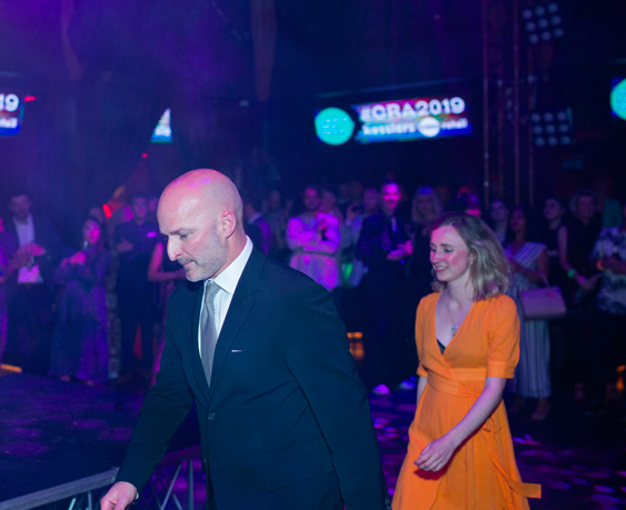
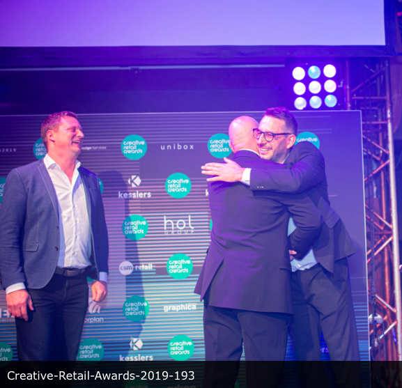
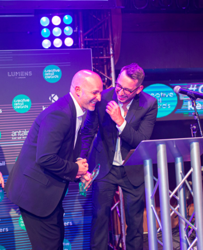
The winners of the Creative Retail Awards have been announced at a night full of exuberance at Proud Embankment, London, on Thursday 6 June.

The Creative Retail Awards have quickly become one of the most distinguished accolades within the retail industry. They recognise projects that have demonstrated the very highest level of innovation and excellence within retail.

The 2019 Creative Retail Awards attracted over 300 entries with a diverse range of submissions from across the world. The awards spanned a number of disciplines, including store design, surfaces, display systems, innovative technology, lighting and much more. The awards were judged by a panel of industry leaders and experts.

The Creative Retail Awards were attended by some of the most influential and creative minds from all around the world.  The night offered retailers, suppliers, brands and agencies a unique opportunity to network whilst celebrating the achievements of our unique industry.

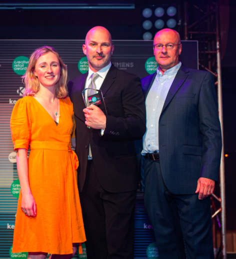
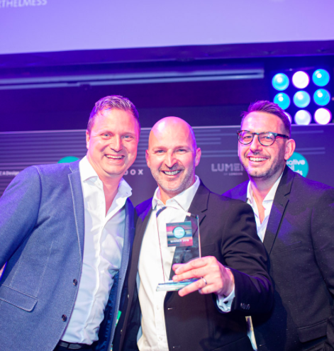
Wow!!! What an Amazing night… and Very Honoured to come away with 2 x Awards:

Winner - Inspirational Person 2019 (Extremely Proud of this one!)

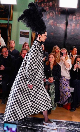
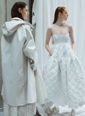
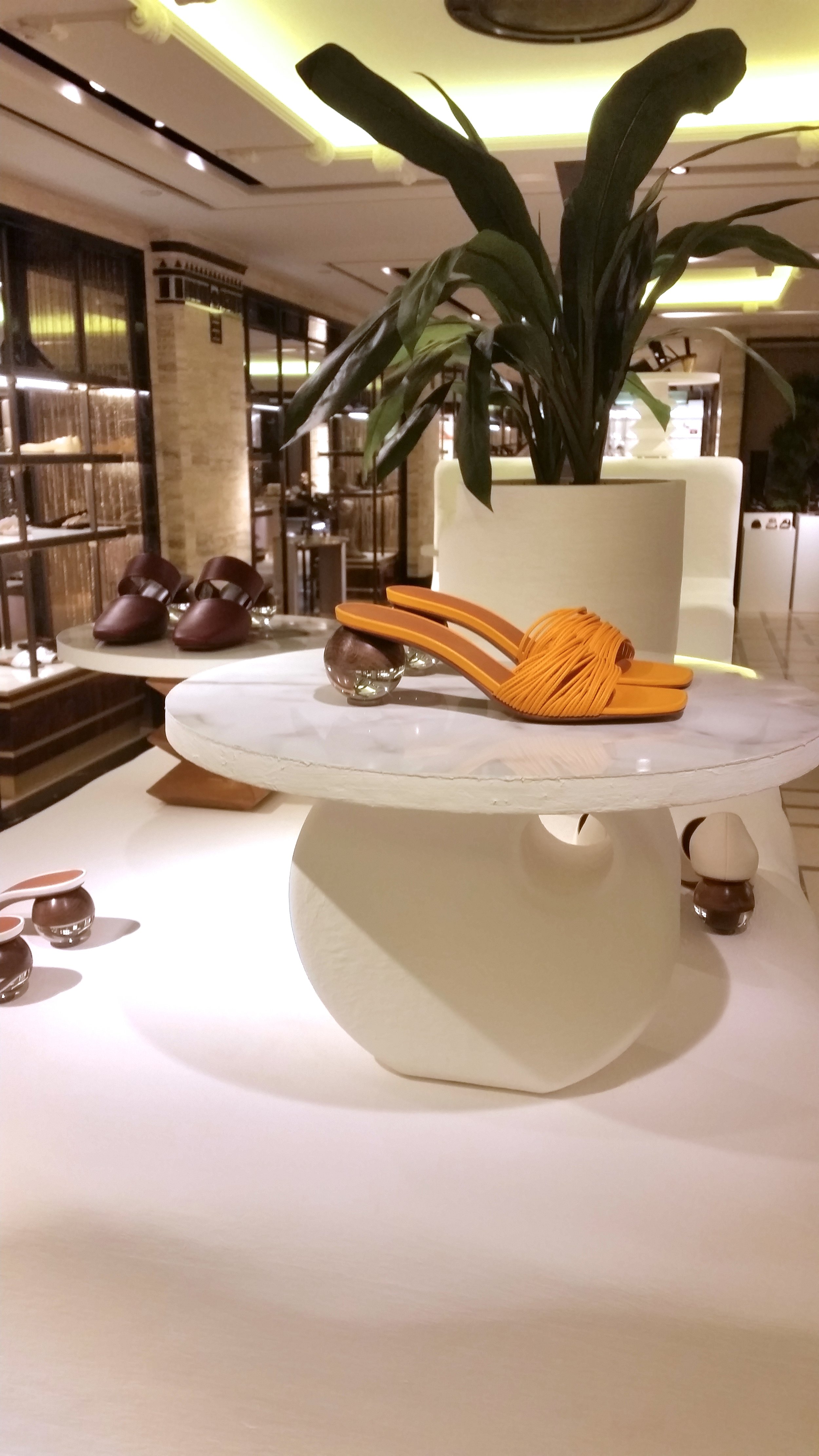
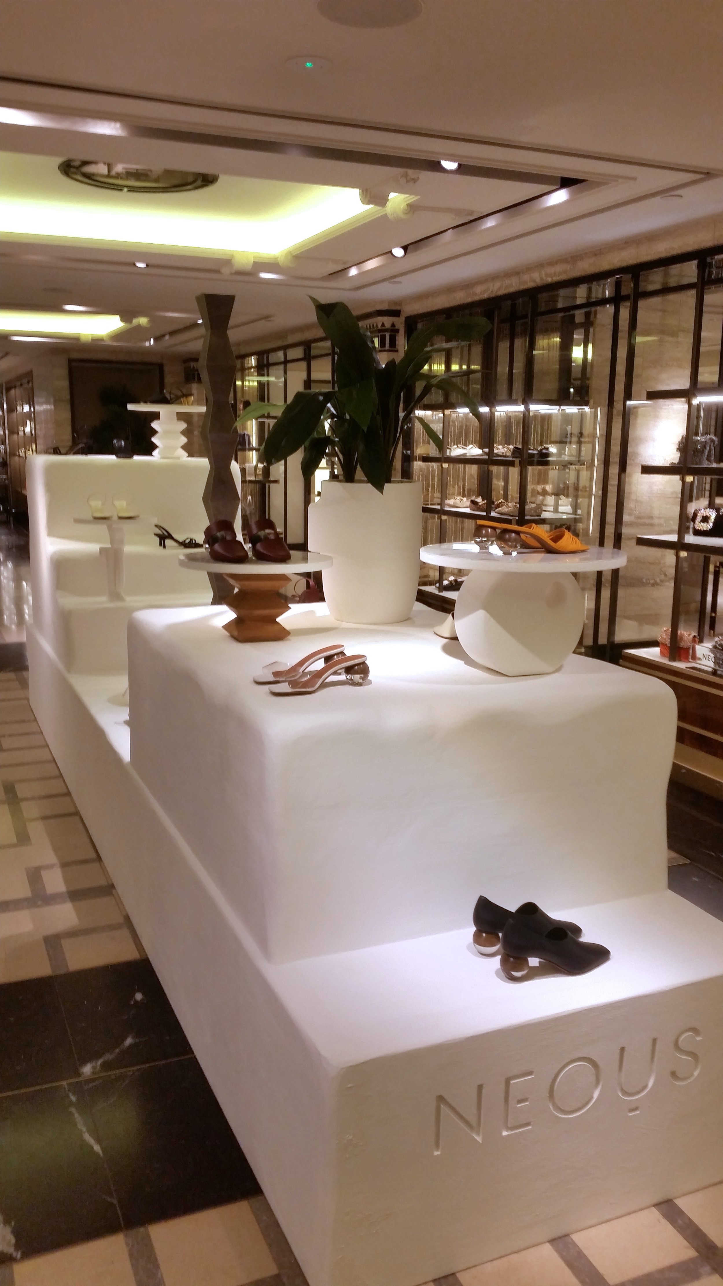
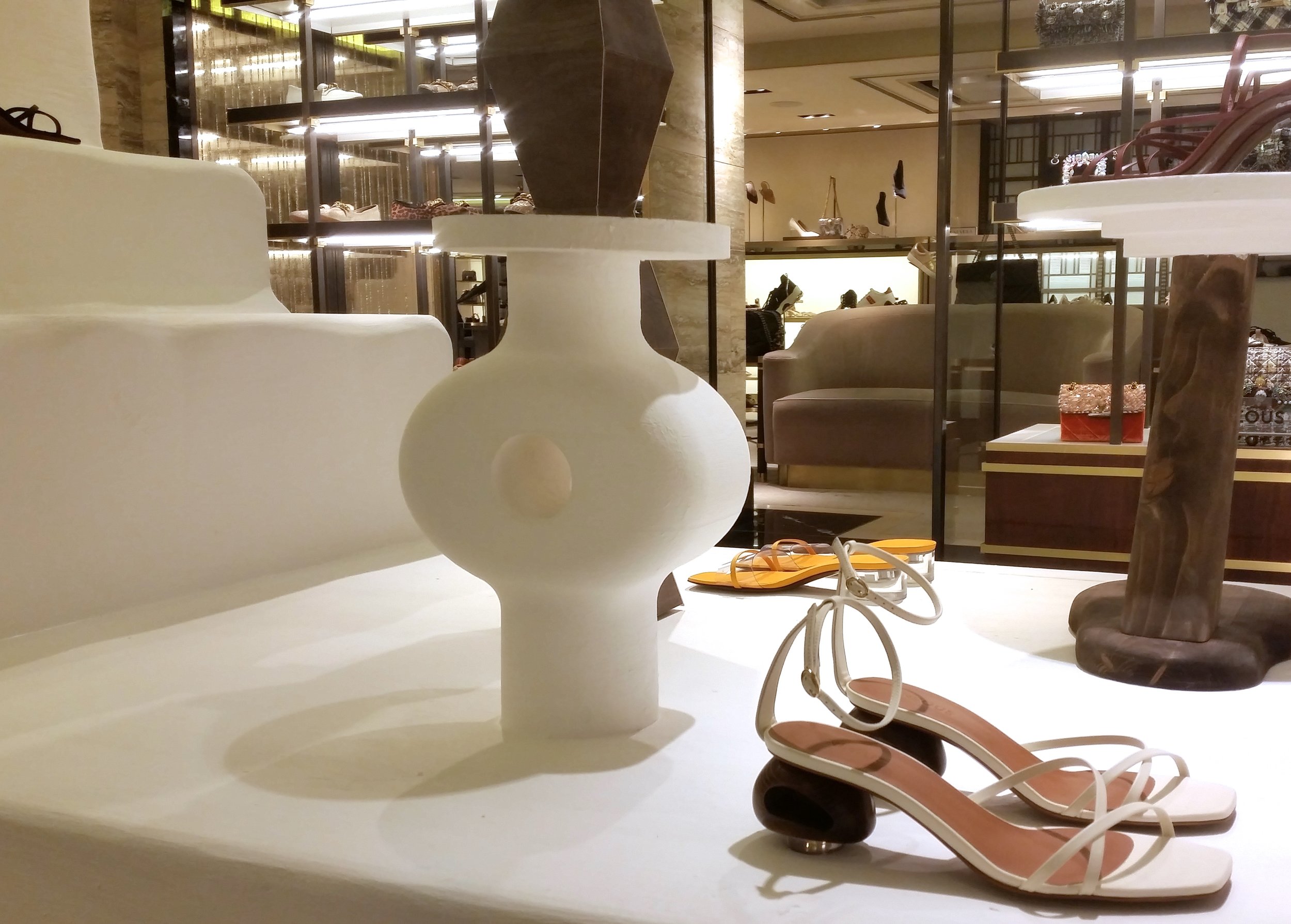
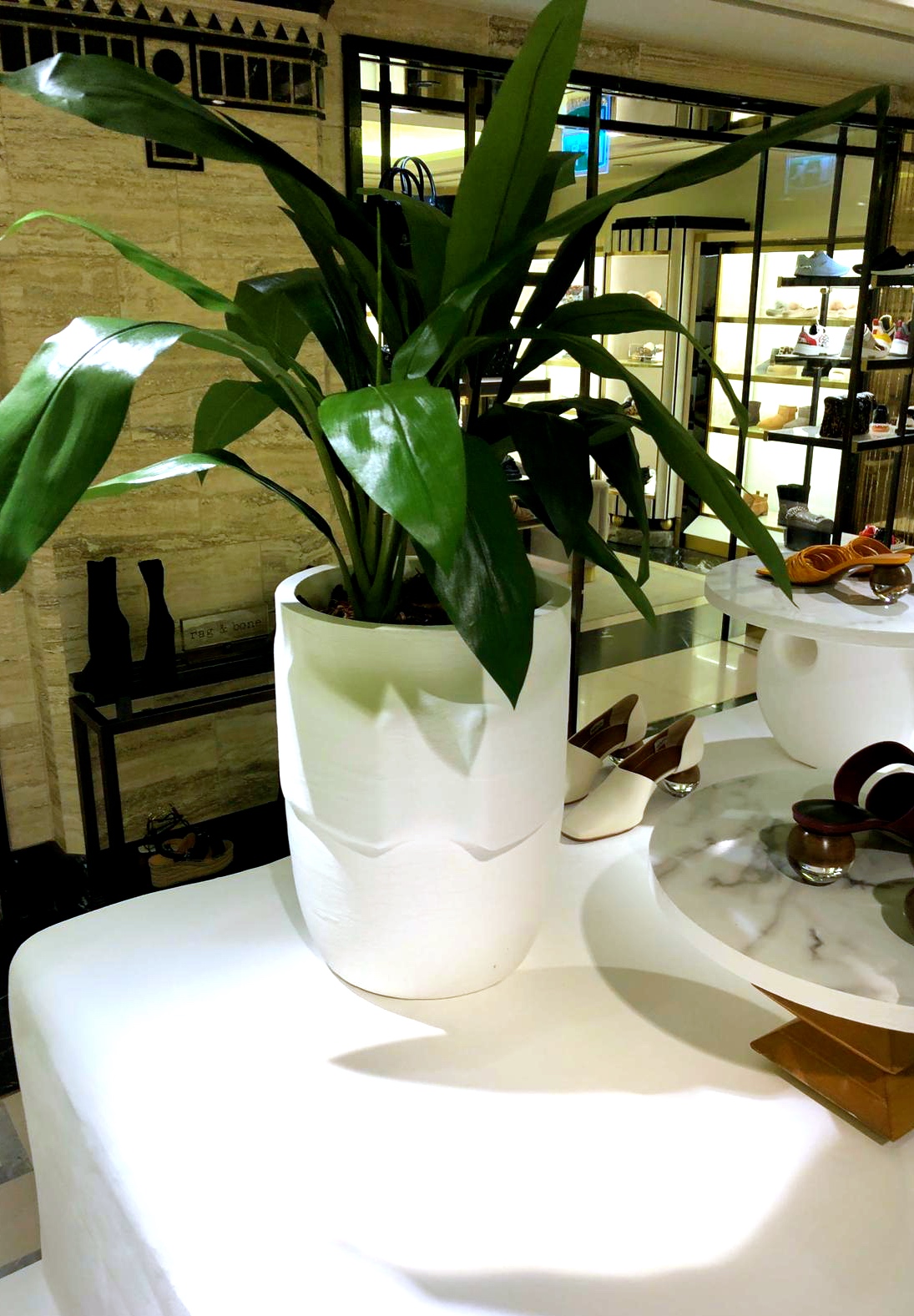
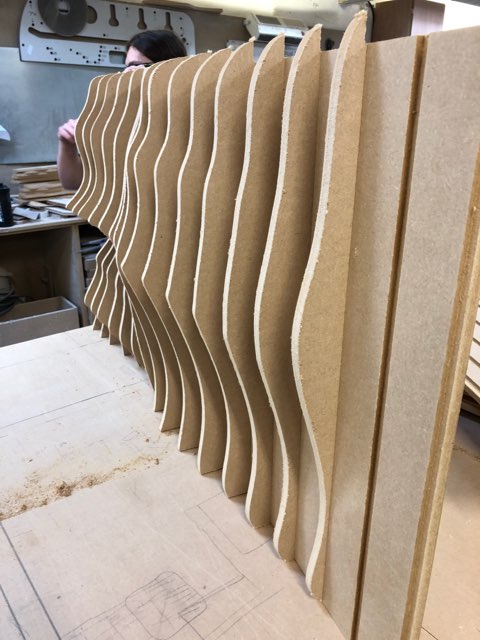
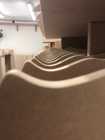
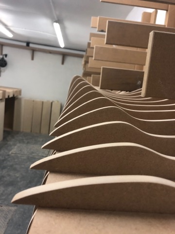
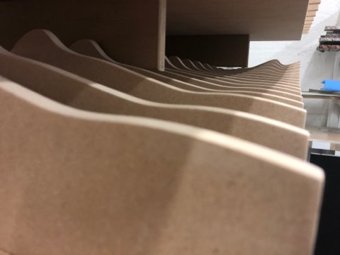
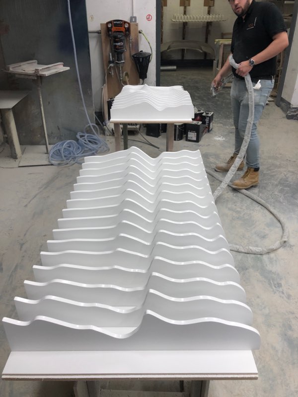
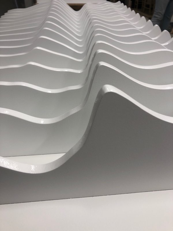
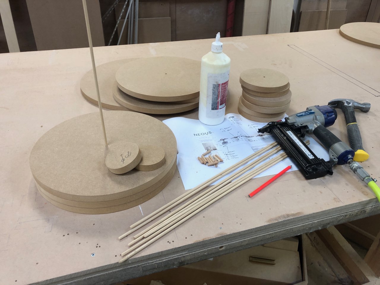
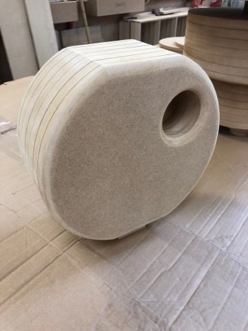
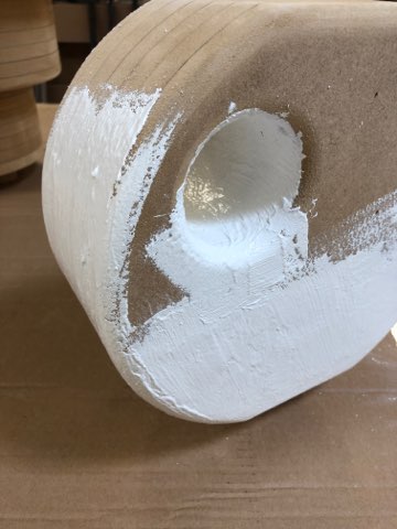
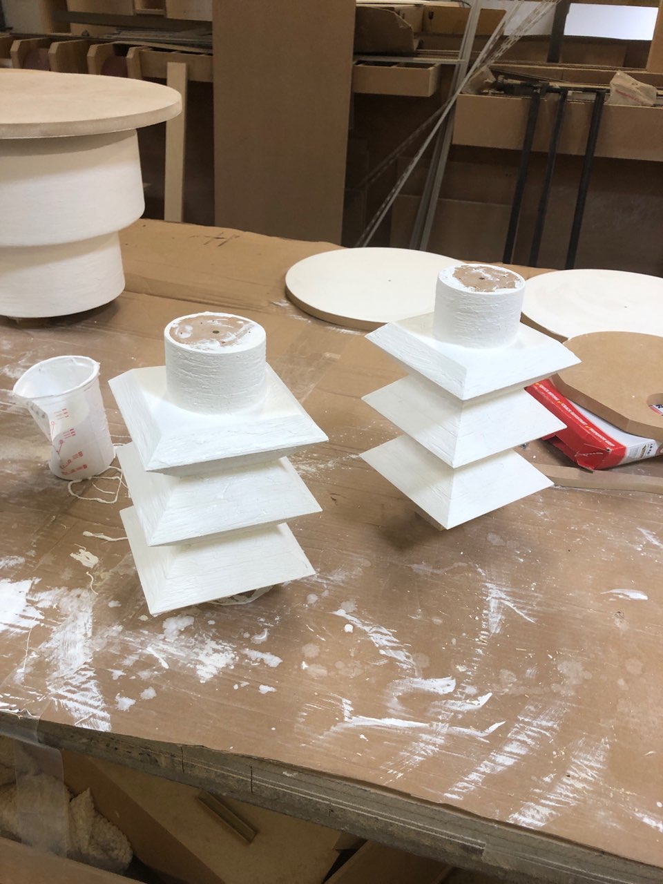
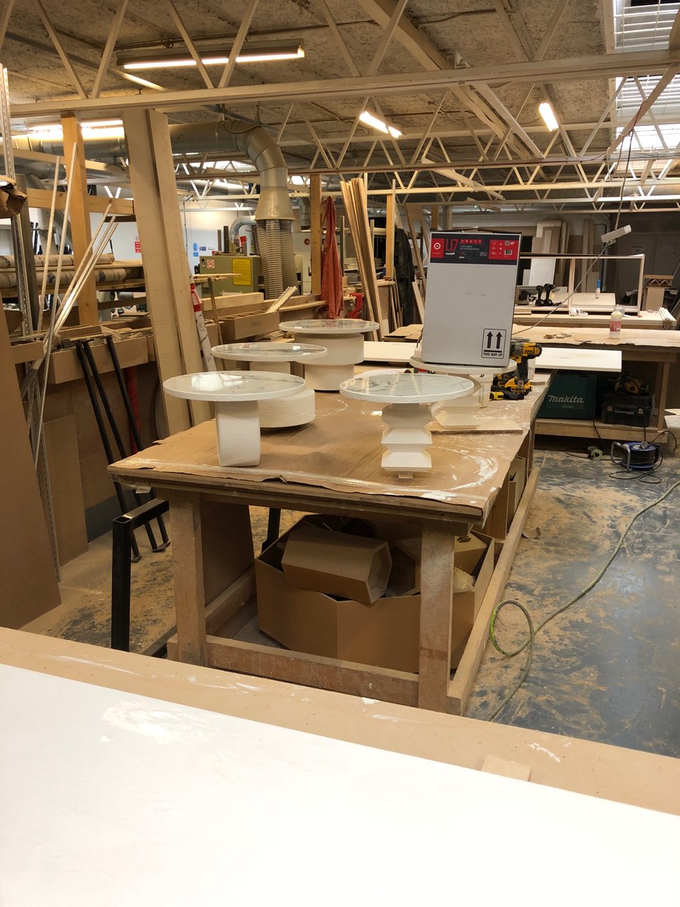
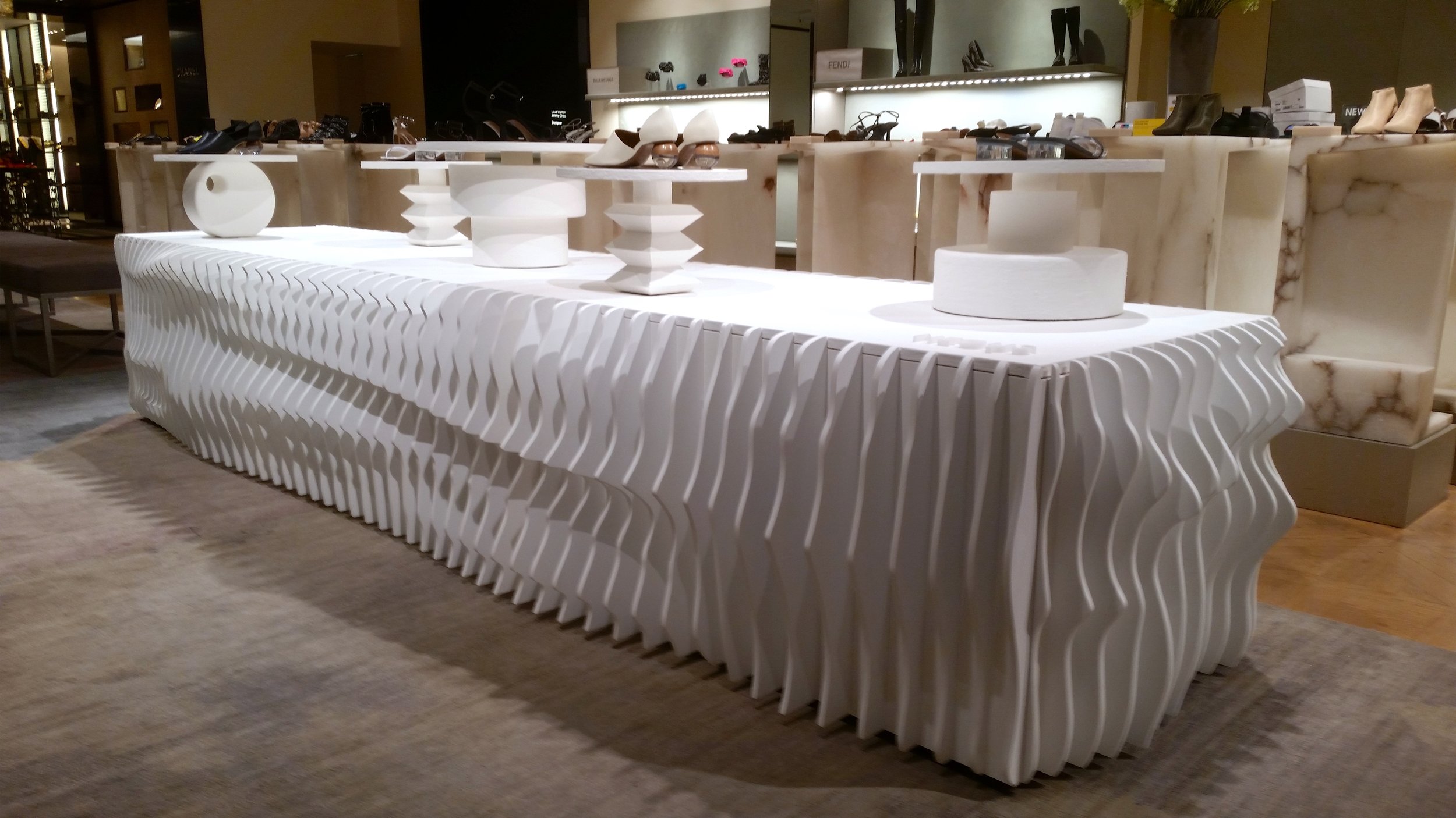
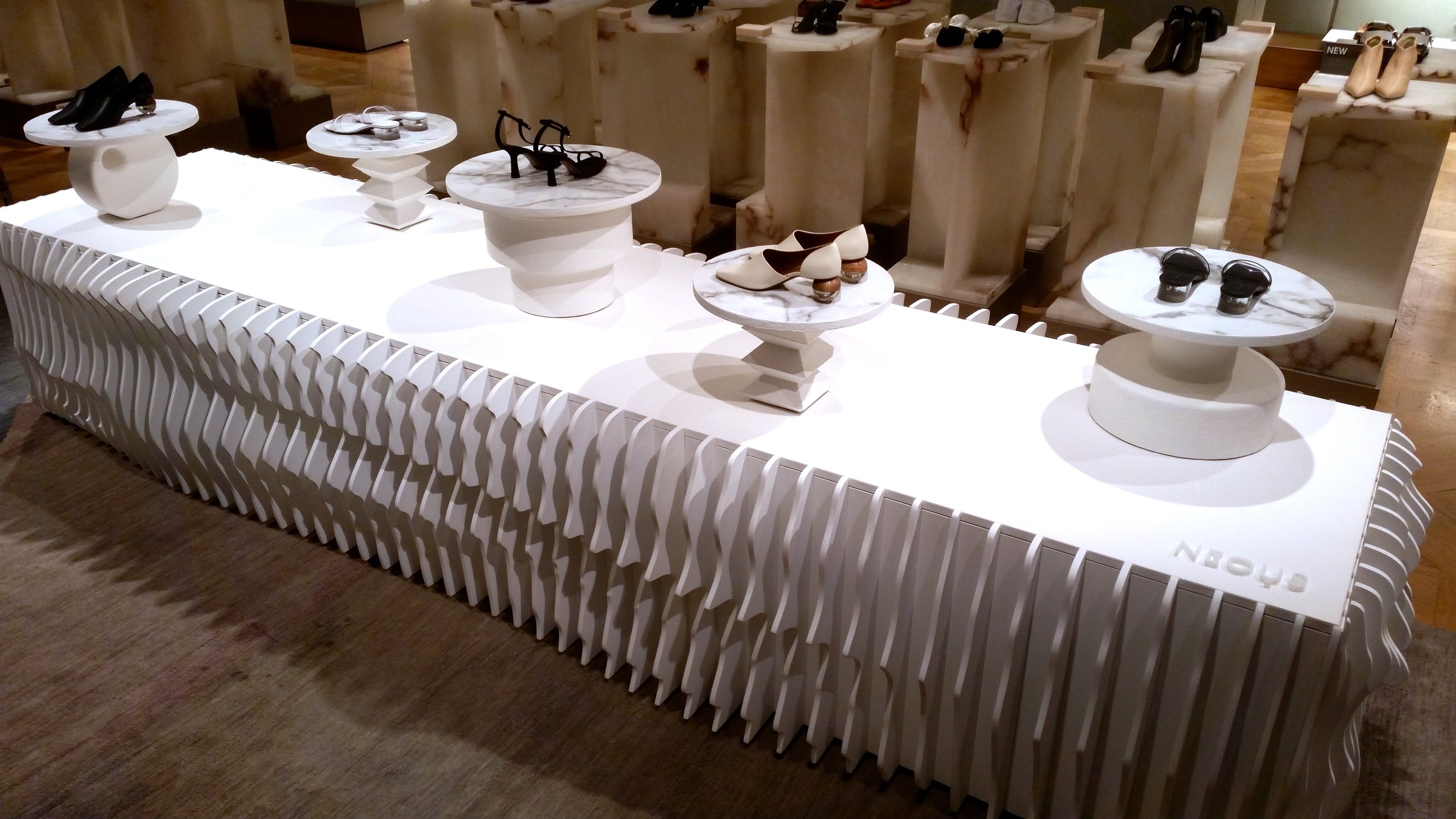
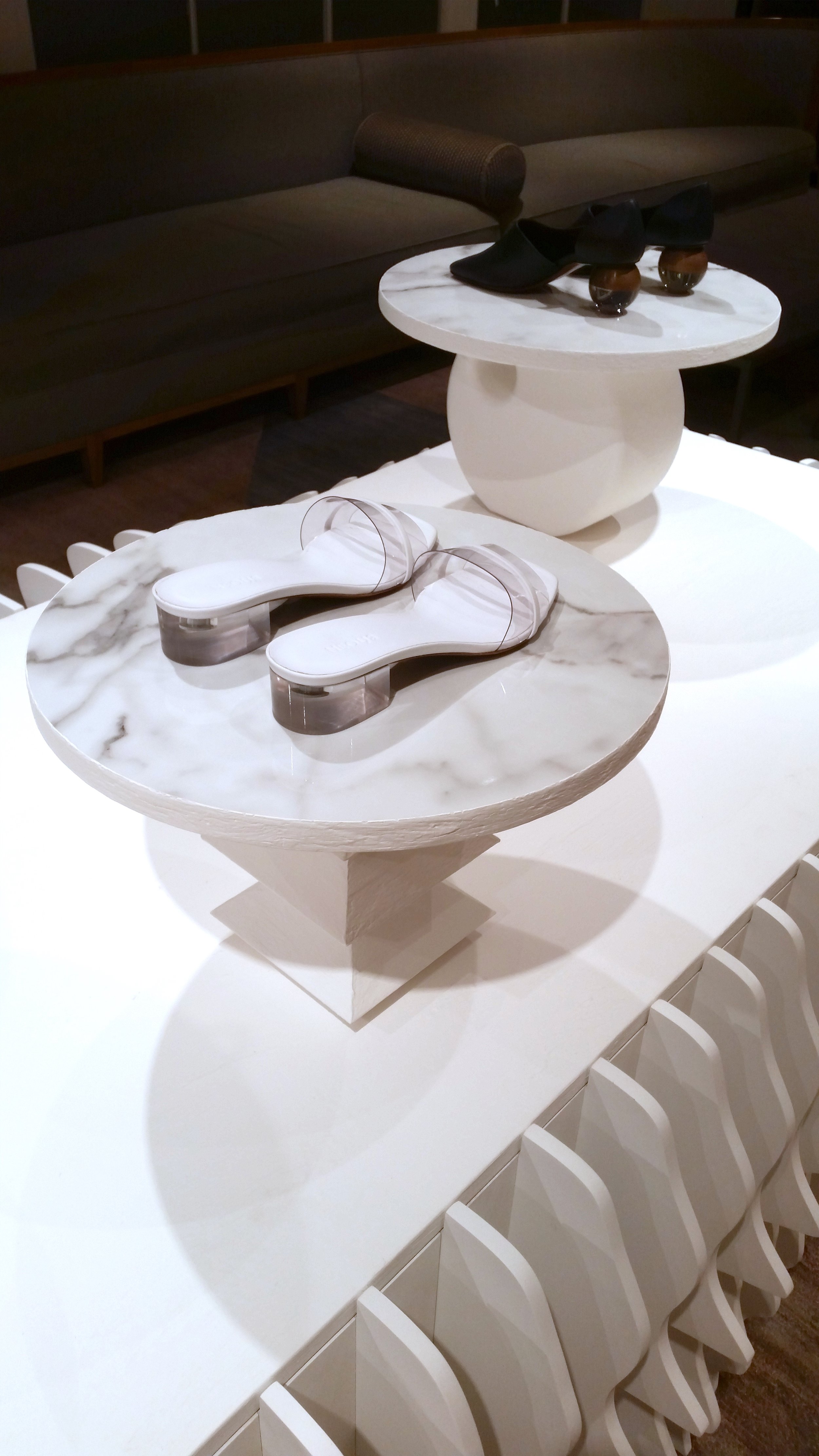
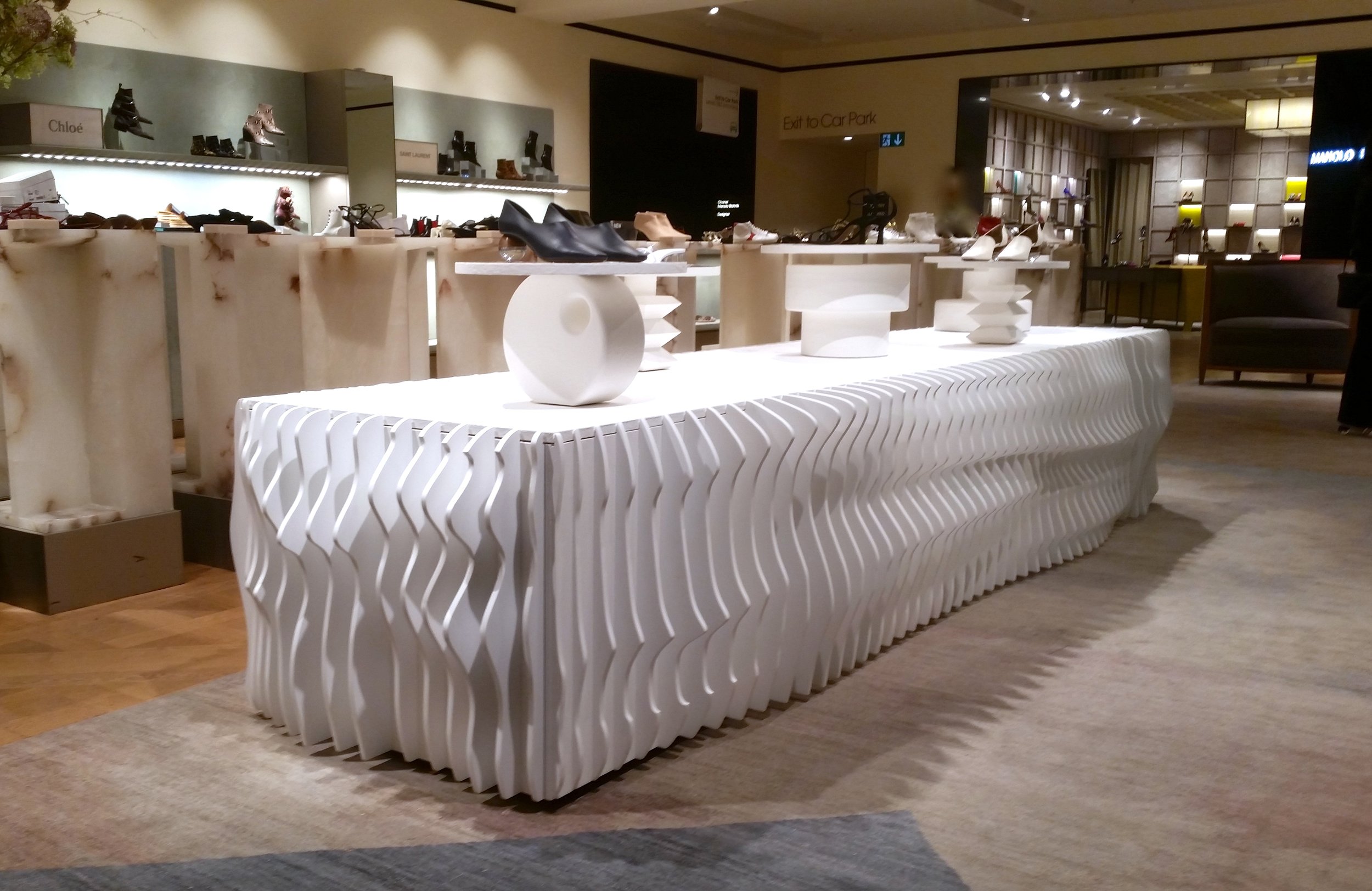
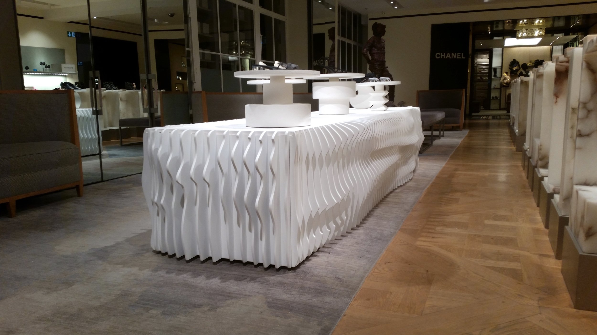
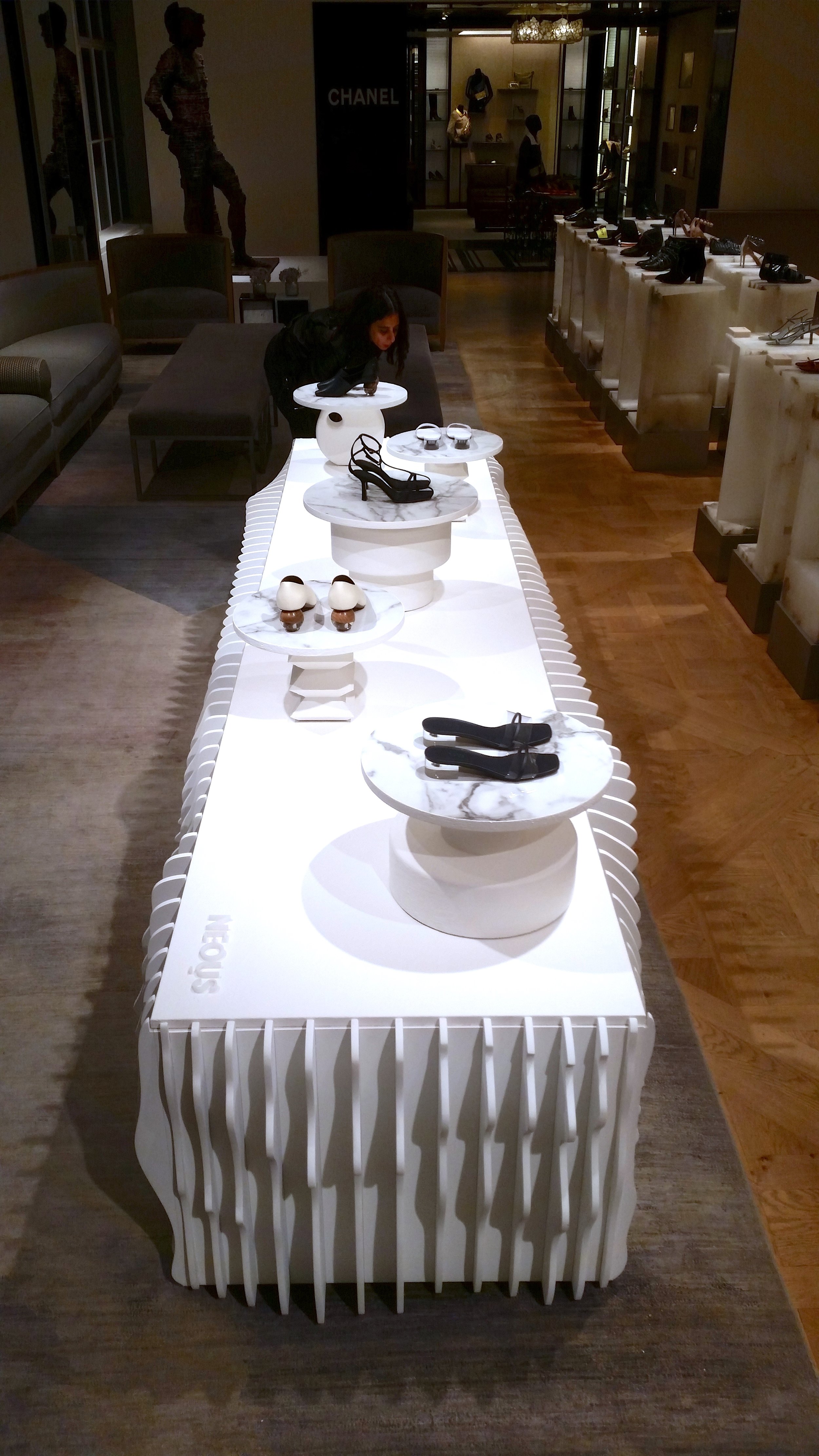
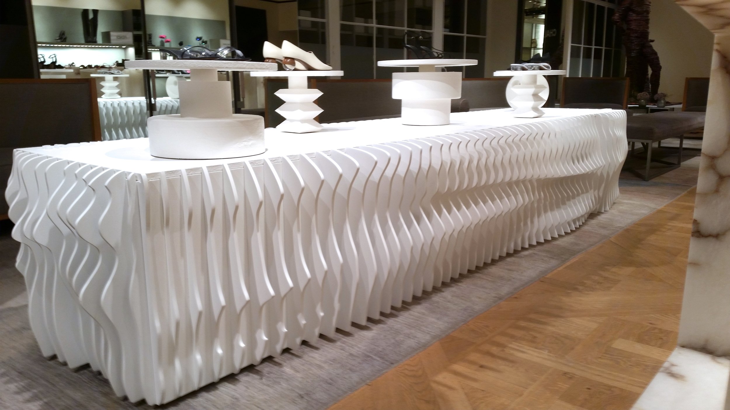
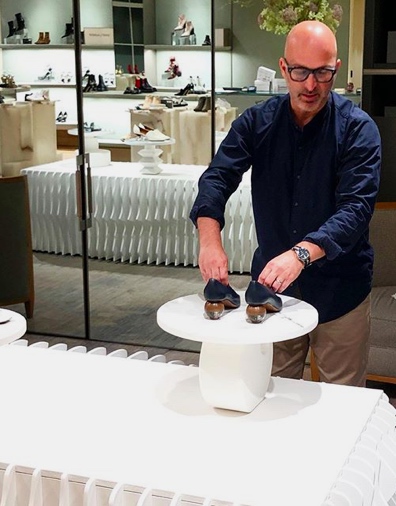
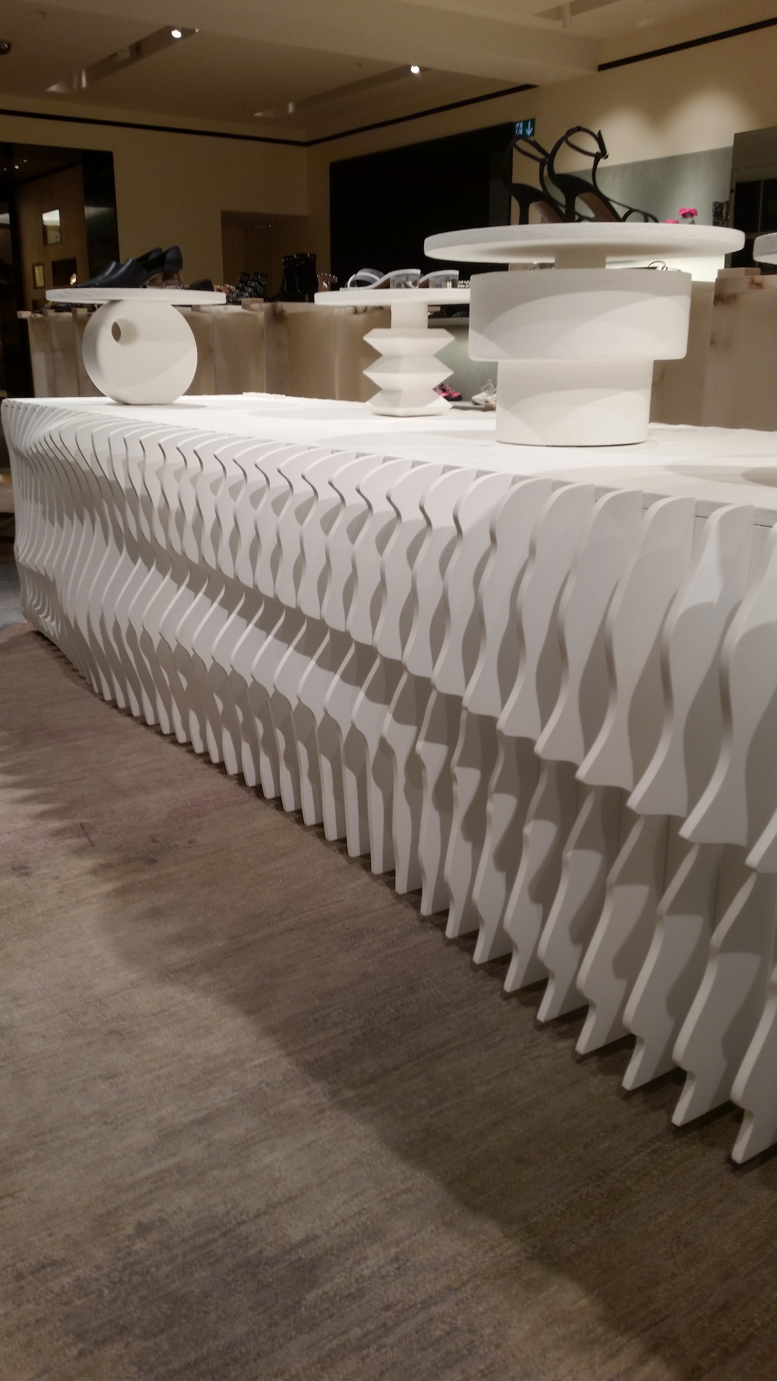
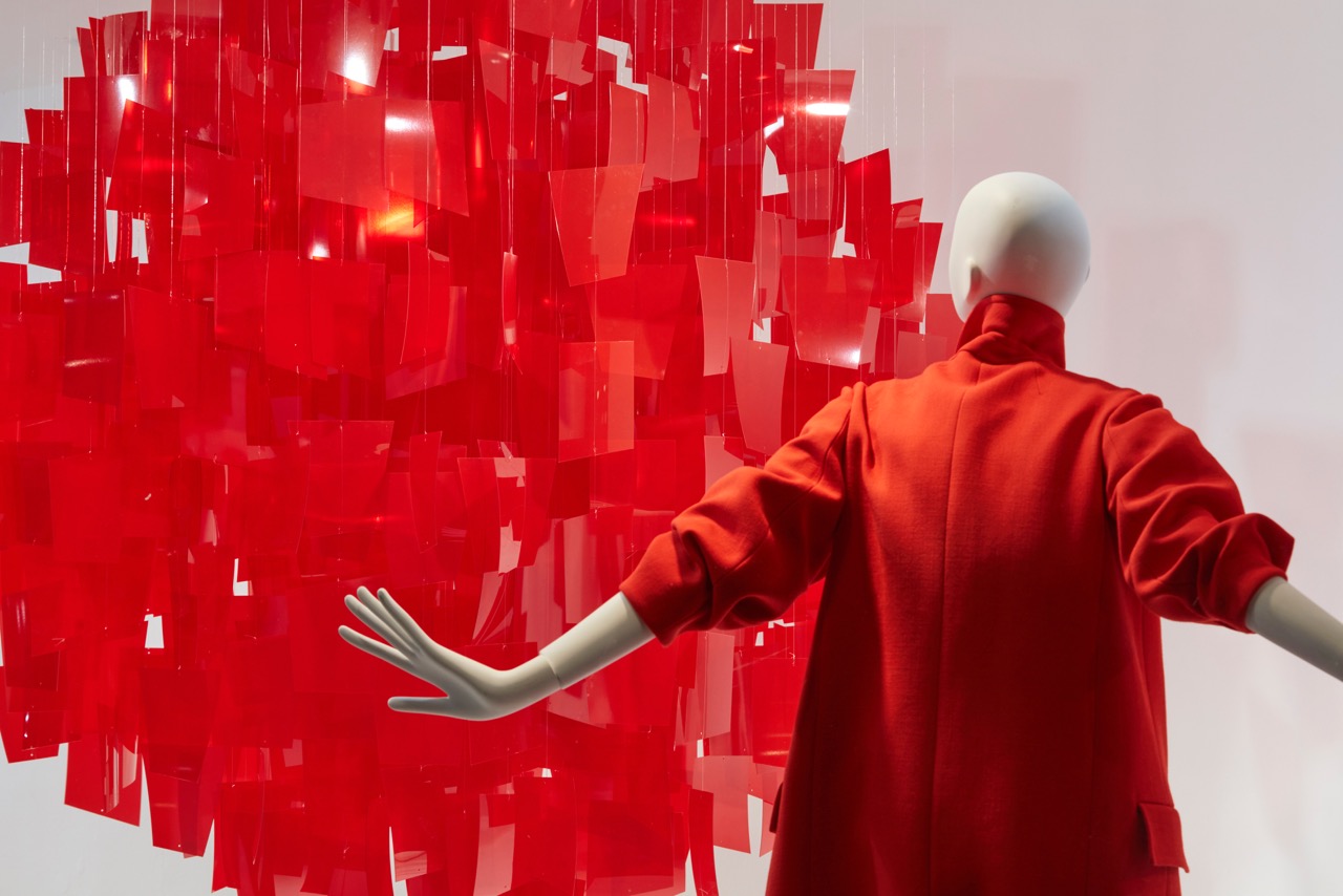
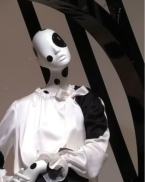
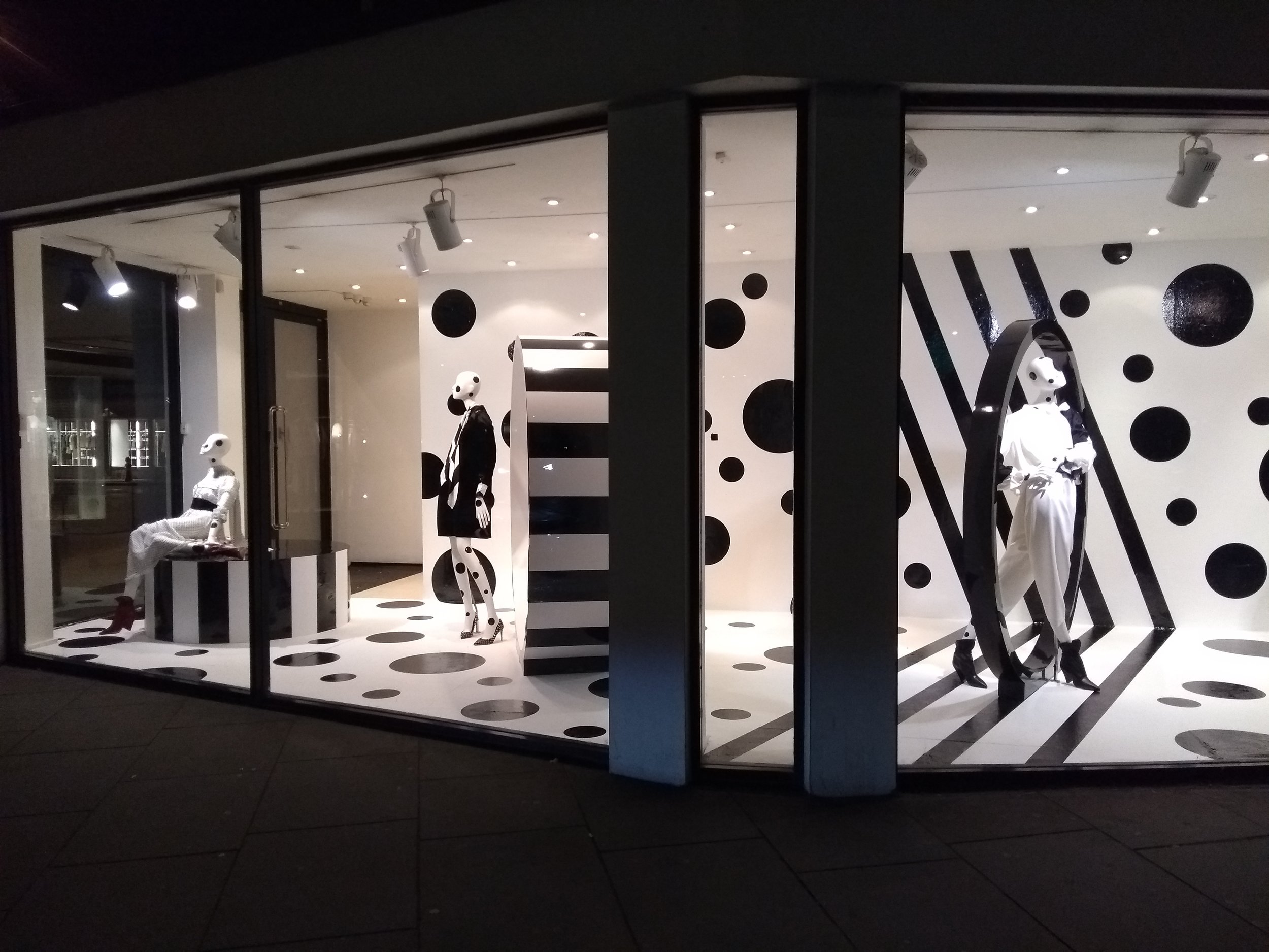
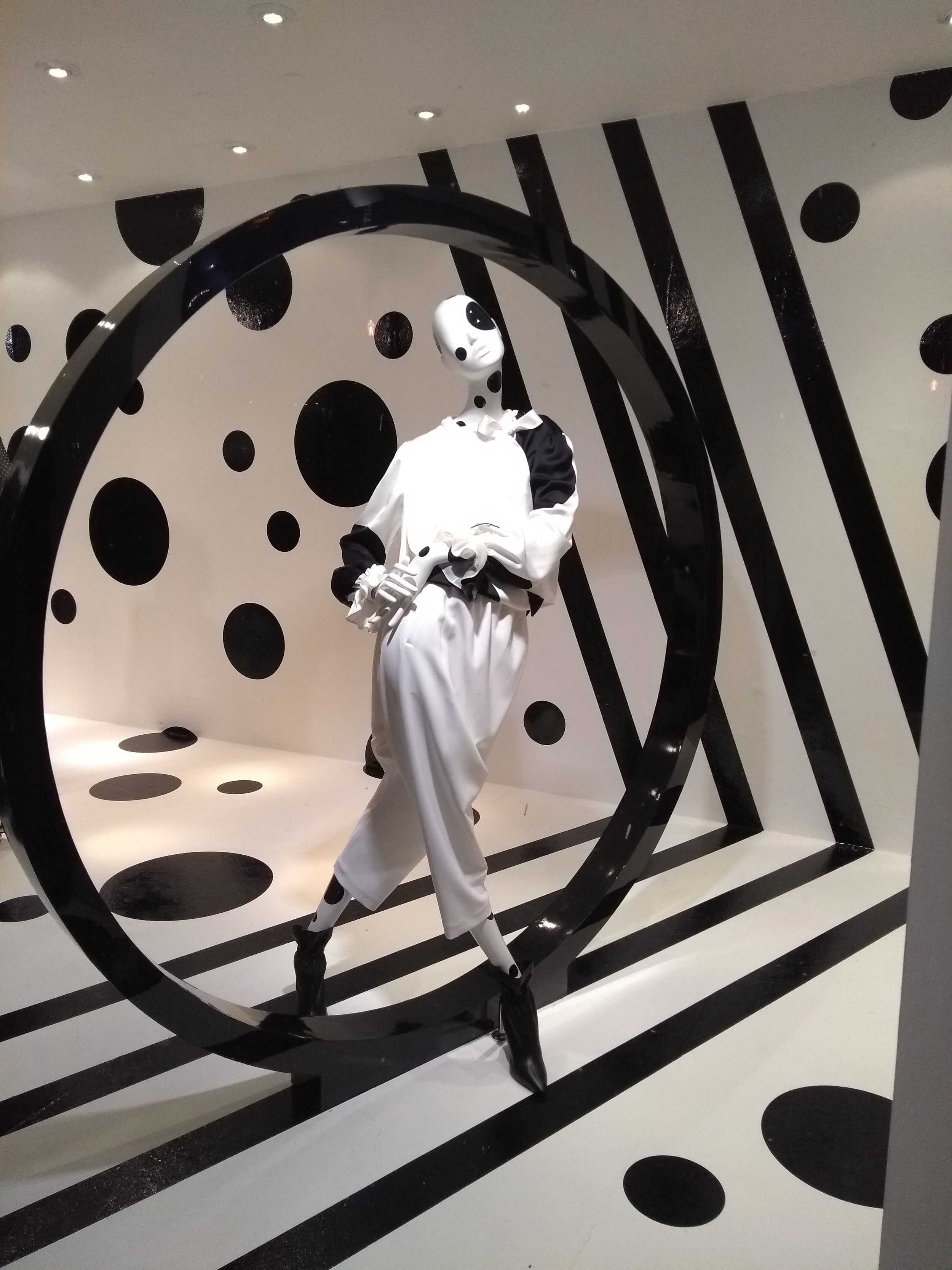
Winner - Best VM Scheme ‘Monochrome’ for Joseph (2nd year running!)

Thank you to the Judging panel.

‘Inspirational Person Award’ – Sponsored by Barthelmess

’From conception to execution – and every stage in-between – this person’s expansive imagination coupled with a perfectionist’s eye for detail drives the entire team in reaching in bolder creative directions.  Having won Creative Retail Awards two years running there is no doubt that the creativity and inspiration that our winner brought to their employer is a key part in both the business’ success and its trademark style.’

WINNER: Nathan Hicks

‘Best VM Scheme’ – Sponsored by The VM & Display Show
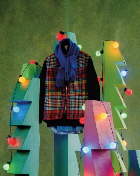
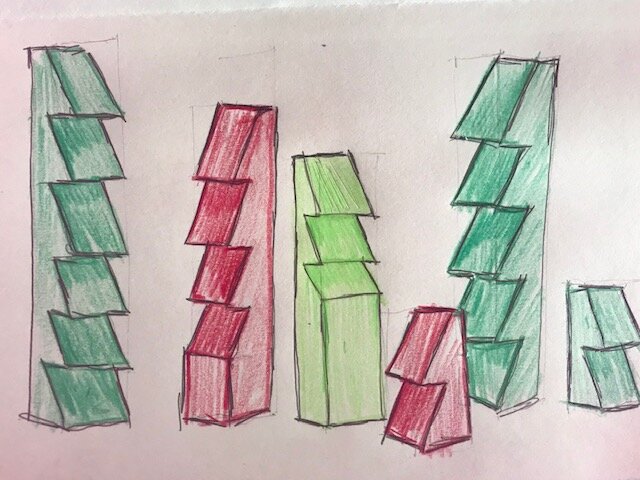
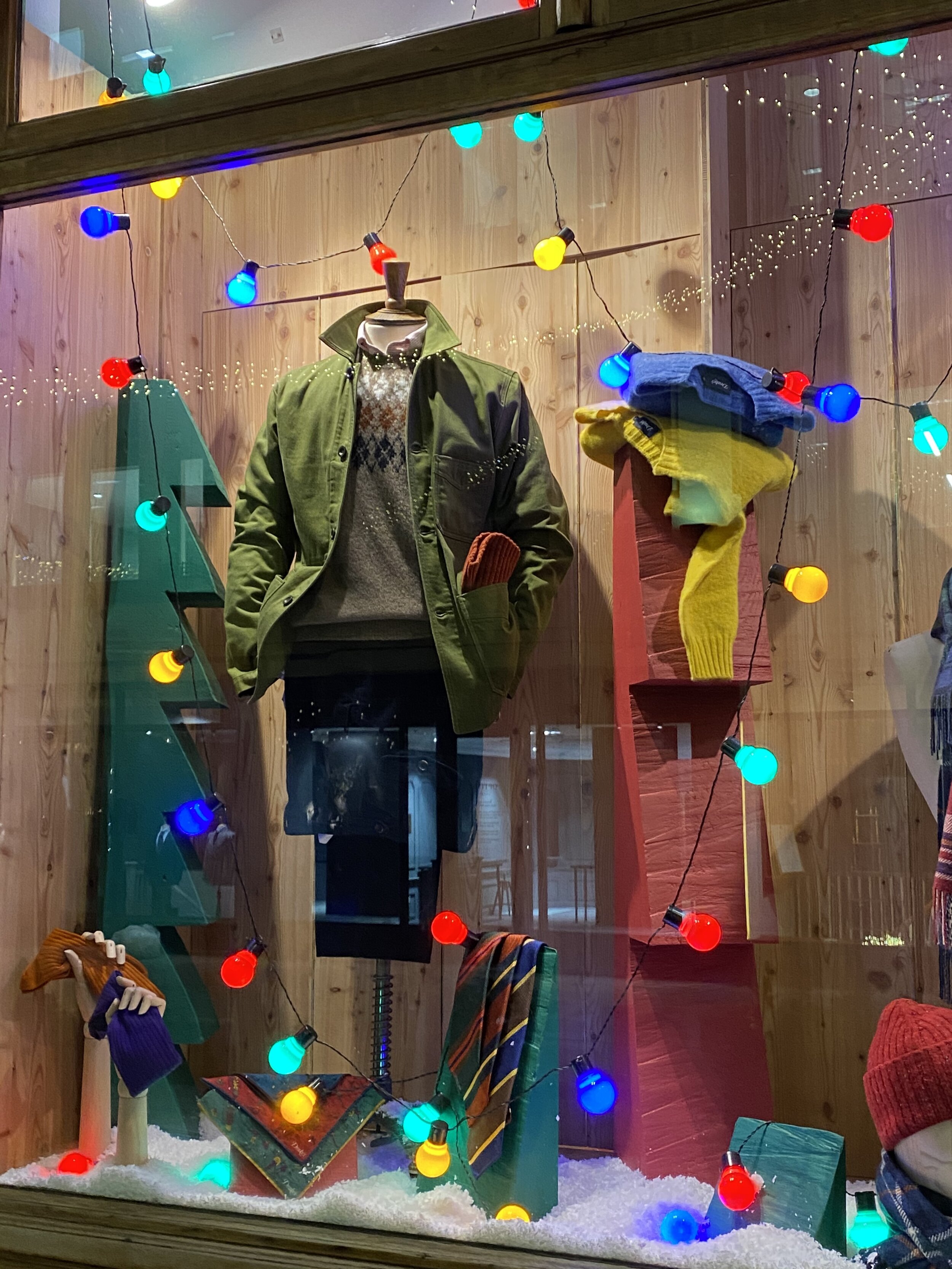
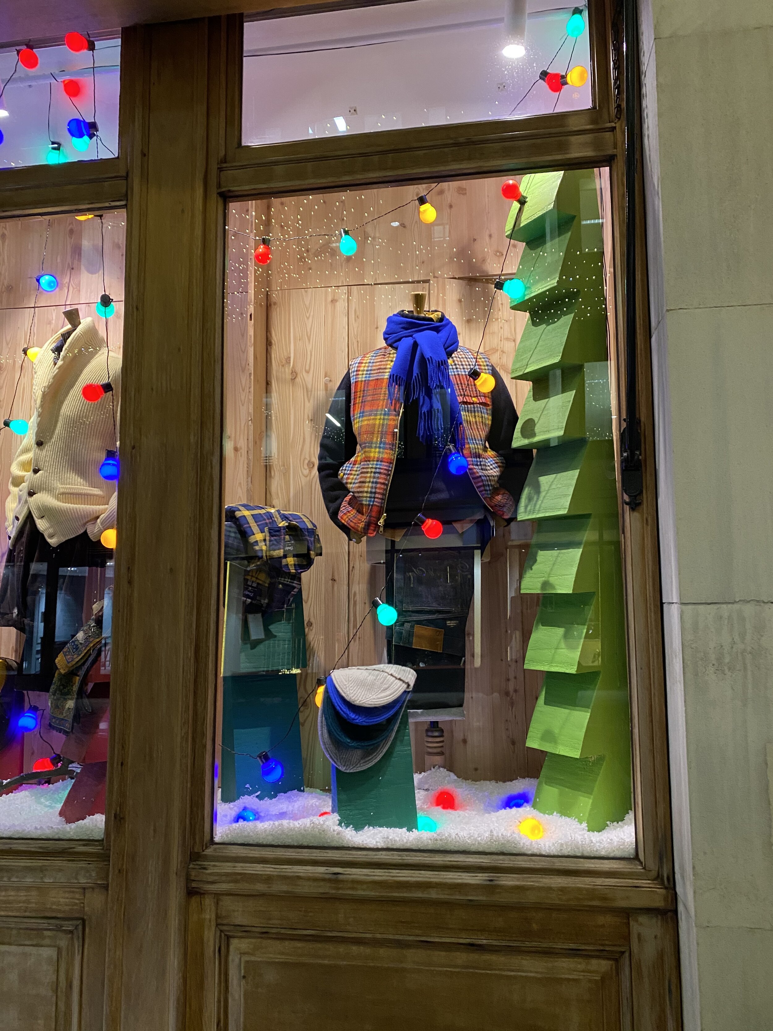
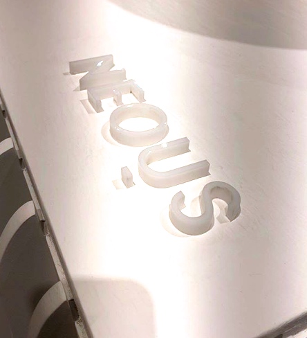
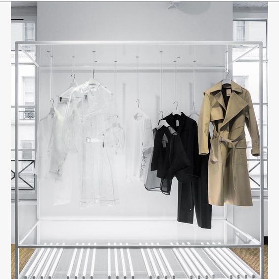
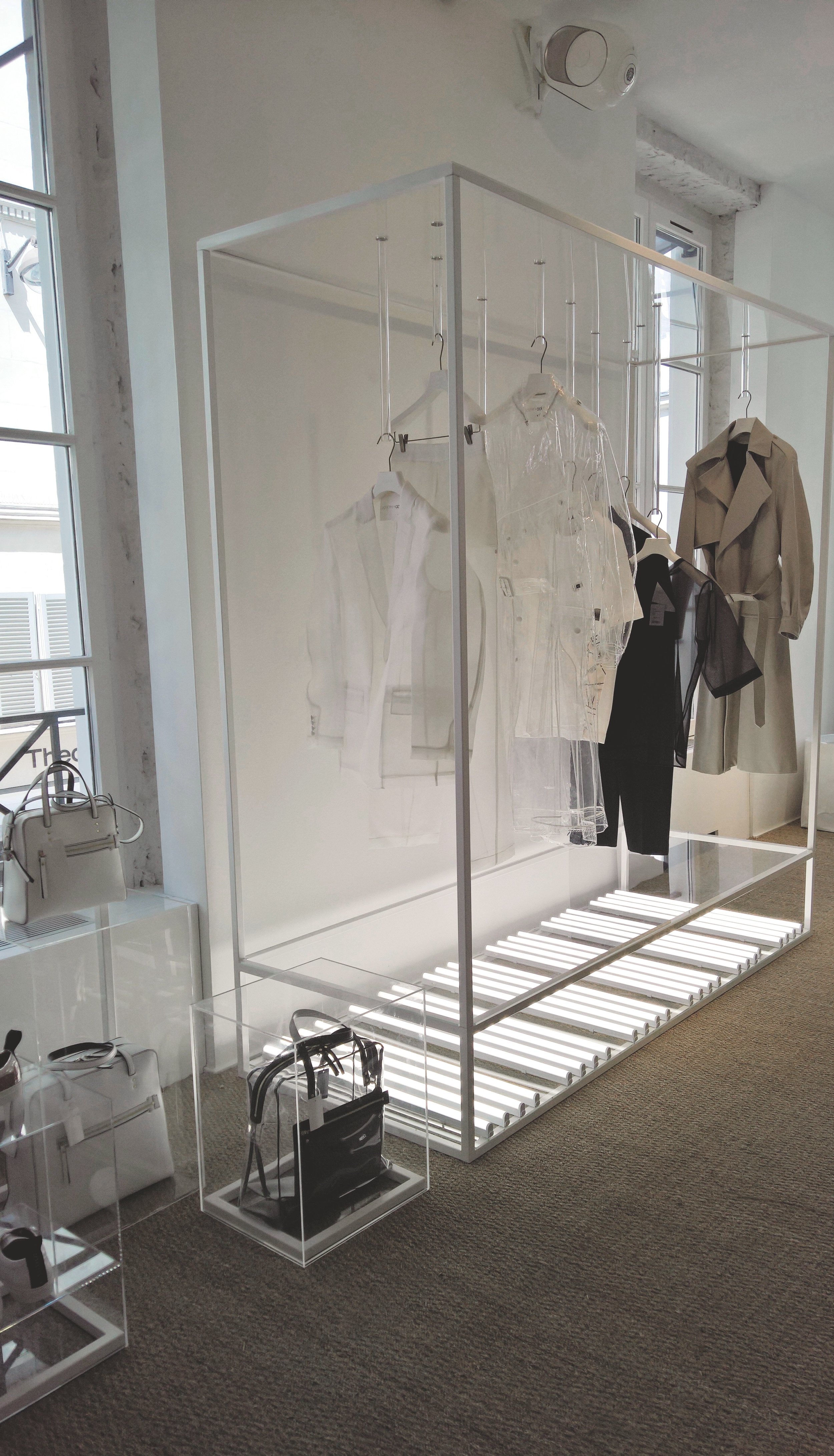
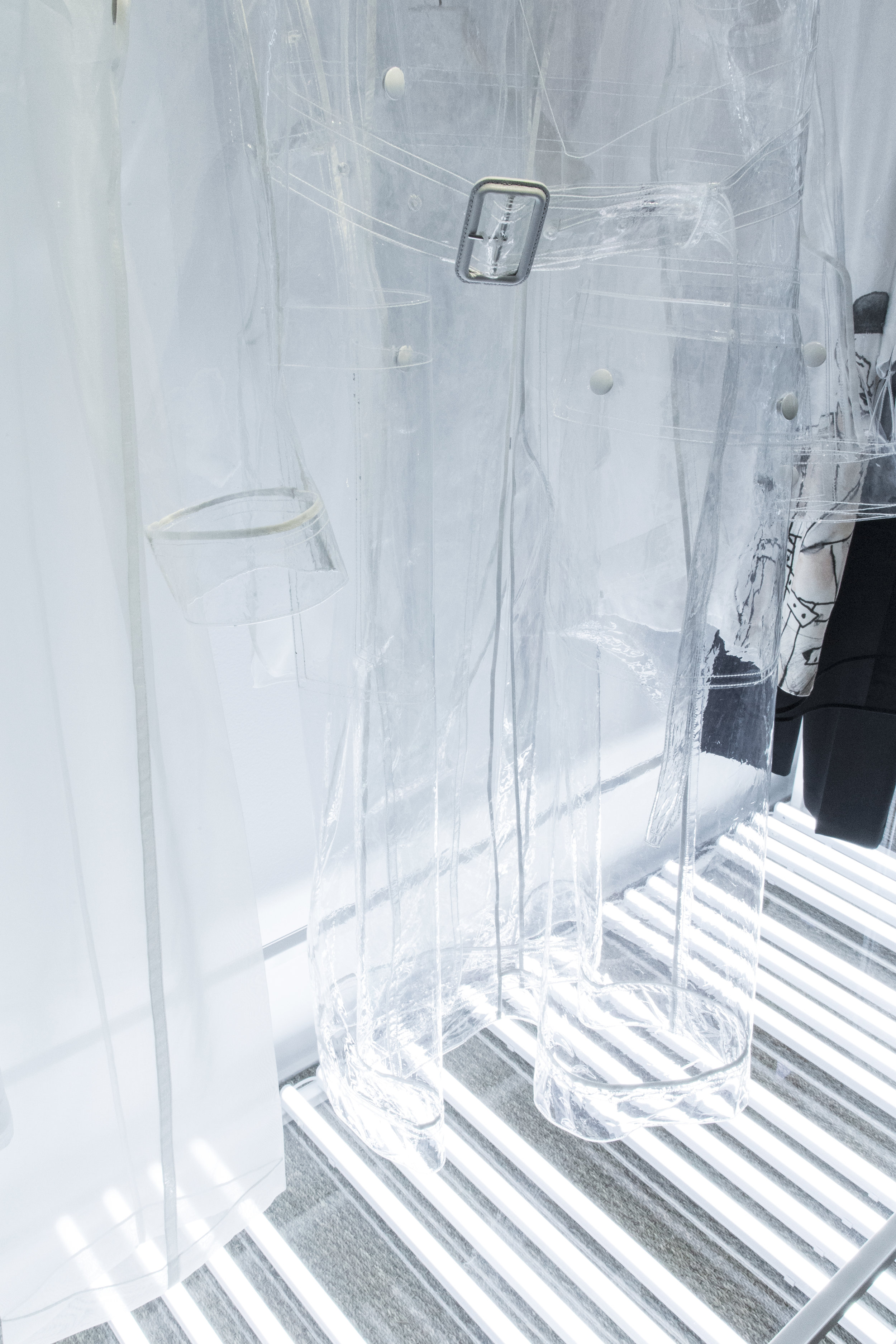
Joseph
’Monochrome’
In collaboration with: Harlequin Design


WINNER: Nathan Hicks for Joseph – Monochrome

Paris

JOSEPH x COLETTE / EXCLUSIVE CAPSULE COLLECTION

8e558c02b61d9799629ddf54e667b4d8.jpg
JOSEPH x COLLETE.jpg
JOSEPH x COLLETE 2.jpg
JOSEPH x COLLETE 6.jpg
JOSEPH x COLLETE 4.jpg
JOSEPH x COLLETE 5.jpg
JOSEPH x COLLETE 3.jpg

JOSEPH Limited Edition Collection for a Pop up space launched in Colette Paris.

CONCEPT BRIEF

THE IDEA FOR THE SET-BUILD WAS TO PLAY ON THE TRANSPARENCY QUALITIES OF THE JOSEPH COLLECTION.

DUE TO THE BUILD CONSTRAINTS DICTATED BY COLETTE, WE COULD NOT FIX ANYTHING TO THE WALL OR CEILING, SO THE IDEA WAS TO CREATE A SIMPLE ARCHITECTURAL FRAME THAT COULD HOUSE THE SUSPENDED VERTICAL ACRYLIC RODS TO DISPLAY EACH PIECE INDIVIDUALLY & WILL HELP FRAME THE SPACE.

THEN TO INTRODUCE A STRONG ELEMENT OF WHITE LIGHT, INCORPORATED INTO THE BASE OF THE UNIT TO POP THE TRANSPARENT QUALITIES & ELEVATE EACH PIECE. THIS WILL ASLO THEN SET US APART FROM THE OTHER BRANDS DISPLAYING WITHIN THE SPACE.

FOR THE EDIT OF ACCESSORIES WE INTRODUCED FREE-STANDING ACRYLIC PLINTHS IN THE SAME AESTHETIC / MATERIAL TO STAND IN FRONT OF THE MAIN DISPLAY.

I